
Friday, November 7, 2008
Magritte- Art for the Analytical Mind

Or consider this one called "The Son of Man." An allusion to the Creation story and its effect on us perhaps?
Sunday, November 2, 2008
Pollack vs. Rothko


So I was having a conversation with a friend who detests Pollack's art but loves Rothko's. So I told him why and was met with an immediate, "GET OUT OF MY HEAD!" I guess that means I was right. Muahaha. I think Pollack is simply about dancing with paint on a stick and seeing what happens, so it's about a lack of structure, and Rothko has a formula- something that you can wrap your brain around. They're both about emotion through color, but one is emotion within reason and the other is just about letting emotion take over. I think that's the kicker- it's hard to just let it all go.
CRAZY BUSY
I have been TERRIBLE at keeping up with this whole blog thing. My business is keeping me extremely busy and I apologize to those of you who check in only to see that I haven't written anything in MONTHS!!! I'll be better. :)
Monday, July 7, 2008
Alchemy


Rustygirlwmu,
Here is a picture of
the triptych I can make
for you. It would be oil
on canvas and the
edges are painted so it
doesn't need frames.
If you like my style I can
do something completely
custom to your
specifications if you like.
Let me know!
Sophie
Thursday, May 15, 2008
Want to see what else I've been up to?


I've been making jewelry and selling them on ebay and etsy.com. My etsy store is sophiesbeads.etsy.com. I have my best stuff there. It's a new and fun way to use my artistic talent. I'm using my hands to sculpt, which I have always enjoyed, but this site is still going to primarily show my paintings.
Almost done

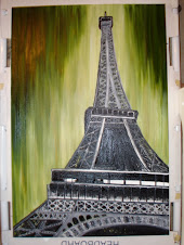
Last night I finished up the Eiffel Tower painting. Now I just need to paint the edges of the canvas and let it all dry. My guess is it will probably take up to 3 weeks to get completely dry.
Sunday, May 11, 2008
Getting closer

I was able to get more of the Eiffel Tower painting done today. Here it is. It is more detailed than the cityscape painting, but keep in mind it is on a large canvas, so it looks more detailed than it really is. This picture is only a fraction of the actual size. Click on the picture to see it better.
Saturday, May 3, 2008
Ready to finish
The Eiffel Tower painting's background is finally dry, so it's ready to get finished. Once it is, though, it will take a couple weeks to dry again. Black seems to be the color that takes the most time to dry. Hopefully I'll have it ready to post a picture in the next couple days.
Wednesday, April 16, 2008
Progress
 I started painting the Eiffel Tower painting and I am loving the colors! I'm going to let it dry before I start painting the tower itself. That way it'll have a more dry-brush look to it like on the bridge in the cityscape painting.
 The second picture is a closer up view to show the brush-strokes. I am being really impatient about getting the tower on there. I keep having to remind myself that it'll look better if I wait.
Monday, April 14, 2008
New Eiffel Tower Sketch
 This is the new sketch for the Eiffel Tower painting. Over the next couple days I'll have it out where I can see it often so that I can identify the mistakes and adjust the lines until I feel I have it ready to paint. What do you think Matt & Cierra?
Friday, April 4, 2008
(Very) Preliminary Sketch

 So this is the pencil sketch of the Eiffel Tower, just to get the placement right. Architecture can be tricky because the perspective and proportions need to be perfect or it just won't look right. One thing I noticed is that my new computer monitor is wide-screened, so it is stretching everything horizontally by about 18%. Looking at the picture Matt and Cierra posted on my monitor it looked great, but when I printed it out it looked wrong to me. It seemed to be too skinny, like someone had skewed it to make it look taller. Basically, I am working off of the way it looks to me on my wide-screen monitor because I think it looks better, like you're actually there under the Eiffel Tower. That will mean, though, that if you have a wide-screen monitor the picture might look too wide. So the first picture is for you if you have a normal screen and the second one is for a widescreen. What do you think, Cierra? Would you like it to be taller and skinnier? If so would a 24x36 be too large?
Tuesday, April 1, 2008
Eiffel Tower for Matt & Cierra


I'm going to be doing a painting for Matt and Cierra of the Eiffel Tower in the style of this green cityscape painting. The plan is to do the background some shade of green, and I think it would look good to have the green be a fade rather than a flat color, almost like in a photo but more stylized, of course. Cierra, I think a 22"x28" or a 24"x30" would be a good size,
but then again I haven't been in the room you're putting it in, so what do you think?
Wednesday, March 5, 2008
Influences Discussion
 In the Pollackesque comments KP and I have been talking about my favorite artists. One whose work I absolutely love is Kandinsky. Here are a few of his works. To see more look him up in Google and you'll find a large number of his works with the Google pics. Kandinsky's work, as with any great art, changed over time. I think he was a master of color and composition
 with his art falling into ALMOST the full spectrum of abstraction (but not quite as abstract as Pollock.) The painting in the sidebar is about as close to Pollock as Kandinsky
 gets, KP, and that's why I insist you take a look at more of his work. You don't get a "my little brother could..." from it. The painting that first got me interested in Kandinsky was the circles one I have posted here. I'm not completely sure why it sucks me into it, but I love it. I think maybe my mind is trying to work the abstraction backwards to see it as bubbles, planets in orbit, dust on my eye's surface, something more tangible.
 The other artist KP asked me to elaborate on is Matisse. I don't love eve
 ry one of his paintings like Van Gogh's, Monet's or Kandinsky's, but his use of color is almost overwhelming, which fascinates me. It goes right to that edge then pulls back. There's so much bright color and I think he must have influenced Rothko's ideas about color and emotion because his colors are so in-your-face that you can't help but feel something. My first reaction to Matisse's work and Fauvism, the movement he was part of, was dislike. I thought it was too busy and jumped out at me too much, but I like the crazy colors now because I think I understand them better now. For example, the painting on the right uses a lot of bright colors but they are balanced out by the rectangle of black and white on the side so that the color is a lot to look at, but not so much that you have to look away. In the one on the right the greens and pink in the corners make the other colors pop and keep your eyes on the center of the piece, the woman.
Does this help?
Wednesday, February 27, 2008
Work in Progress
I had a request for pictures of a painting as I work on it step by step. Here is a short slide show of my most recent painting showing it in progress in 3 steps.


Rothko, in response
KP, yes, that frame is for the small blossoms painting. In response to your questions, I don't have anything planned yet for the large canvases, but having access to them gives me more options, and if anyone wants some really large art I can now accommodate. I've got to say I was really excited to see them!! About your Rothko question, he did indeed use really big canvases for his most famous work, like 10 feet tall. I found a good video on YouTube about Rothko, and at 5 min into it you can see the canvas sizes.
Monday, February 25, 2008
Canvases
I now have access to some huge canvases. The largest is about 48"x60" and 2"deep. At some point I would like to get all of the equipment to stretch my own canvases , and then I could make them as large or small as I want, but for now I have to go with the pre-made canvases. KP, I have a barn-wood frame to go with your painting we talked about.
Saturday, February 23, 2008
Pollock-esque

Okay, so this is my Pollock-esque painting. I did it more for kicks than anything else. It's fun to experiment and see what you can do, right? So what do you think? Is it art or does it just look like a piece of a house painter's coveralls? I think I would like it better if I did a set of them each with different colors to be displayed as a triptych.
Thursday, February 21, 2008
Splatter

I wanted to see what it would look like if I just dumped the paint onto the canvas. I meant to hang this in my tv room, but I don't think it works there, so I'd be willing to sell it. It is 24"x36".
Starting up
Starting this blog has been on my mind for a while now, and it's finally started. Its purpose is to be a place for discussion, sharing of ideas and, well frankly, if you see something you like and would like to buy or want to commission me to paint you something then that would be great too.
Subscribe to:
Posts (Atom)