So this is the pencil sketch of the Eiffel Tower, just to get the placement right. Architecture can be tricky because the perspective and proportions need to be perfect or it just won't look right. One thing I noticed is that my new computer monitor is wide-screened, so it is stretching everything horizontally by about 18%. Looking at the picture Matt and Cierra posted on my monitor it looked great, but when I printed it out it looked wrong to me. It seemed to be too skinny, like someone had skewed it to make it look taller. Basically, I am working off of the way it looks to me on my wide-screen monitor because I think it looks better, like you're actually there under the Eiffel Tower. That will mean, though, that if you have a wide-screen monitor the picture might look too wide. So the first picture is for you if you have a normal screen and the second one is for a widescreen. What do you think, Cierra? Would you like it to be taller and skinnier? If so would a 24x36 be too large?

 I started painting the Eiffel Tower painting and I am loving the colors! I'm going to let it dry before I start painting the tower itself. That way it'll have a more dry-brush look to it like on the bridge in the cityscape painting.
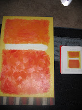
 The second picture is a closer up view to show the brush-strokes. I am being really impatient about getting the tower on there. I keep having to remind myself that it'll look better if I wait.