
KP, yes, that frame is for the small blossoms painting. In response to your questions, I don't have anything planned yet for the large canvases, but having access to them gives me more options, and if anyone wants some really large art I can now accommodate. I've got to say I was really excited to see them!! About your Rothko question, he did indeed use really big canvases for his most famous work, like 10 feet tall. I found a good video on YouTube about Rothko, and at 5 min into it you can see the canvas sizes.
Wednesday, February 27, 2008
Subscribe to:
Post Comments (Atom)

9 comments:
Thanks for the video. He was covering the canvas in glue first? Why? Also I am probably just a product of American culture but the super-sized canvases are awesome, I can't wait to see what you are going to paint. Do you have consistent influences or does it vary? I have noticed a lot of my writing is influenced by not only what I am reading but also the music I am listening to at the time, sort of a blending of medium. Does that ever happen in any of your works?
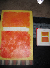
All canvases are prepped before you can paint on them so that the material will be taut, firm and the paint will stick. I guess that glue was his method. My canvases that I buy are all ready for paint before I buy them. Certainly I am a product of my influences, and what I like to look at changes. For instance, when I first started painting I really liked looking at portraits and the ways people did them (probably because I thought that they would be the hardest things to paint so I wanted to get better at doing them), so I did more portraits back them. I went into a Van Gogh phase that I still am not out of because I love his use of color and his technique and use of texture are so unique. It was a deviation from the very realistic style I had been trying to do, and I've come to realize that doing realistic portraits or trying to do anything in the photo realistic style is good for decorating houses with family portraits, but most people don't look close enough to realize they are looking at paintings anyway, so they may as well just be blown up photos. I think music is a great inspiration for art. I like my paintings to be like songs that are just wrong enough to be right, meaning, the really technical stuff doesn't have to be right on because you get more emotion and expression out when things aren't quite perfect, like at the end of a good song when they improv some and see what comes out. Your ear blends it and it becomes a melody like your eye blends an impressionist painting. My other influences are Kandinsky, Monet, Seurat, and more recently Rothko and a little Pollock, among others. My last painting (which I will post tomorrow) was influenced by Rothko, but the colors are from the outside of a house I saw on tv.
Add Turner, Matisse, Degas and Klee to that list of influences.
I really liked the video on Rothko. I want to try to find the rest of it! Anyhow, your comment about the similarities between the art and music you like hit me like a ton of bricks! Music and art being “just wrong enough to be right” really made a lot of sense to me. I look at my musical influence and my artistic tastes and the mesh. Tom Petty, Grateful Dead, Neil Young, The Clash. . . None of those musicians have ever been accused as being “Pop” music! Their genius lies in their poetry or the technicality of their music. I look at artist like VanGogh, Monet, Turner, and others, in the same light. They took aspects of “Art” that were just pieces of a puzzle, so to speak, and made those the elements that captivated! Color has always been important, but until the impressionists, it never really jumped out and hit you in the face! Their technique is rough and detail distorted, but their paintings were more beautiful than those technically perfect renditions of reality! The beauty lies within the battle your mind has to reconcile the lack of reality with the amazing color. Same can be said with Tom Petty: That guy has a horrible voice, but the lyrics and music more than compensate! Beauty is not perfection in reality.
Well said!
Great response, very insightful. I agree with "you get more emotion and expression out when things aren't quite perfect." In writing I do the same thing, use of metaphor or lack of detail to create the relationship with the reader, by filling the gaps they invest in the work and have a form personalization/possession. I would like to know more about your influences and what you take from each, I don't know much about Degas, Seurat, Turner, or Kandinsky.
Kandinsky I love because of his use of color and it's just abstract enough to get me thinking about what he's trying to portray. There are motion and emotion in his work. Turner used the most beautiful colors and they are almost smeared in his skies. I like his technique of abstracting a clearly discernible picture. Degas was a master Impressionist and was really good at using light in his paintings. I think I take brush stroke technique from Seurat more that his use of color, movement, etc. (because the paintings are too flat and motionless for me, but the way he makes your eyes blend the brush strokes was genius). I would have examples of each artist here, but the html code doesn't work as well in the comment section.
The examples on the sidebar help out a lot, Turner didn't sound familiar but I have seen that painting before. Anything by Matisse? At some point I will need some help with Kandinsky. I do like his color but he moves closer to Pollock with the busy composition.
Post a Comment